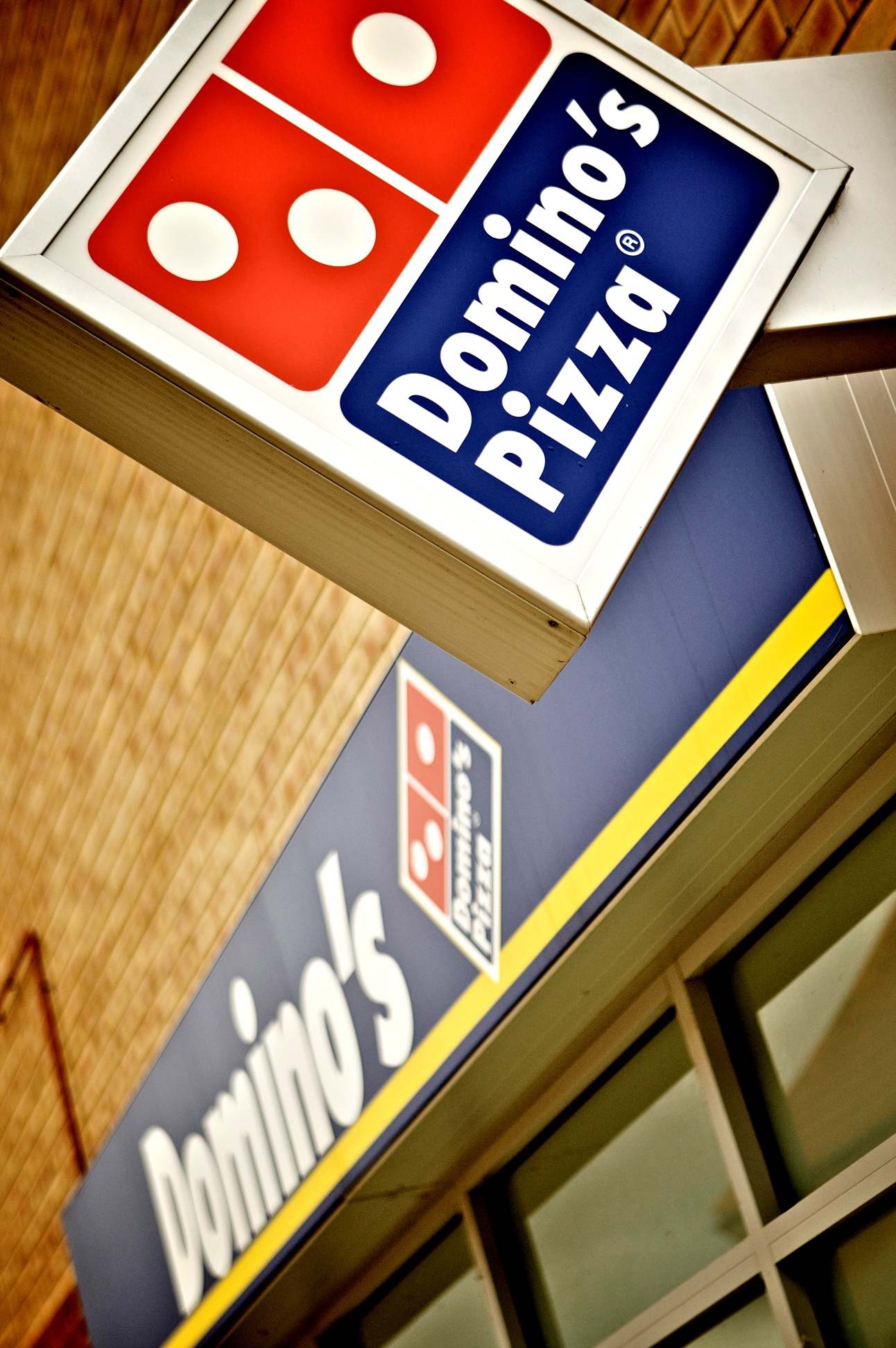
 Designing a sign that is going to be effective requires taking into account the shape of its construction. Stop signs have a unique octagon shape that is easily identified from great distances, even when the backside is the only side viewable. Street name signs are always in the form of elongated rectangles. Highway signs are always big green squares while the yield sign is an upside down triangle. The shape of your sign is going to impact the influence of its message.
Squares, Squares, Everywhere Squares
The most common sign you will see is a square or an elongated square in the form of a rectangle. The human mind learns to notice change and spot differences in the environment. The simple act of changing the shape of your sign is a huge step in the right direction of effective marketing. The first thing your sign must do is get noticed. Be a circle in a sea of squares or a triangle in an ocean of rectangles. The response by oncoming foot or auto traffic is to glance at “the one that is not like the others.” You can even consider designing an irregular shape into your sign. Consider major fast food restaurants that you can remember off the top of your head like the “golden arches” or “the bell” that have mastered the use of signs to the point of perfection. The signs for these companies have become so ingrained into the public that the signs are symbolic of the company itself. Anyone would call that a victory!
Message Contour
The shape of your sign is always a factor, but there is a relationship between the shape of the sign and the message upon it. The reason the “golden arches” works is because they are symbolic of the company name they represent. There is a direct and readily identifiable symbolism. There does not have to be a symbolic correlation behind the shape design and the message reasoning, but for a long lasting and memorable effect there is a greater success in the signs effectiveness when there is. Try to use the form to influence the message. Consider a company like Target that uses a bull’s eye to represent its name. Simple. Effective. Neat and clean. The symbol has replaced the need for a word, and the branding is quickly placed anywhere they want it to go.
When the outline of the message and the shape of the sign are uniform, then there is going to be a harmony between the two of them that will generate an iconic marketing response. When you think of contour and iconic in the same sentence, think of Las Vegas, Nevada. If you had to picture the significant signs in the city prolifically filled with signs, which ones come to mind? Do you see the words Las Vegas in the white backdrop with the light bulbs all of the way around it on the wavy rectangular sign? Alternatively, do you think of a cowboy with his hat leaning over the Vegas strip? These are signs at their best and epitomize effective marketing campaigns. While your needs may not be as grandiose as this, you can have a proportionate response and measureable effectiveness with your signs.
Whatever sign you decide to go with, make sure there is a purposeful intent and gauge the message against the shape of the sign. Does it seem ambiguous or does it seem to make a statement? Will the combination of shape and messaging make a definitive and simple message that seems almost meant to be? A banner, flag, or any other type of messaging post should be used for the maximum effect and convey the desired message. Choosing a sign that does attract attention, but does not send the right message is counterproductive and should not reach production. To get the most out of your message the shape should influence the content in a positive conciliatory manner. Remember, simplicity has the best results. Furthermore, you want to make sure you have a professional sign designer, something you can find through websites such as qualitysigndesigner.com
Ray Donato is a freelance writer who has studied much about small business operations and lives by the constant reminder to not neglect traditional marketing for your storefront even in the growing digital sphere. If you wish to learn more about Ray you can visit him on Google+.
